UI/UX design for a fire protection system
Introduction
Marioff is part of United Technologies, a market leader of the fire protection systems for marine business. This work focuses redesign of the digital release panel. The release panel has two main functions;
1. Its´ purpose is to keep the users (crew of the vessel, engineers, safety - and deck officers) up to date and detect abnormalities of of the fire protection system on-board.
2. Manual release the section valves dedicated for the protected machinery areas in case of fire.
The release panel is located in the bridge and in the engine control rooms of the vessel. The panel size varies in accordance with application. Larger ships are equipped with 24 inch panel and the smaller applications are equipped with the 12 inch panel.
Project duration: 4 months Role: UI&UX -design.
Design process
How it was done
In this case the process was relatively straight forward. The initial idealization were conducted along the existing panel in which the basic usability issues were fixed first, and then in the next phase the design was revised once internally and with customers and altered accordingly. This approach was taken due to lack of resources; workforce & time as this was self-initiated project.
Vs. How it should have been done
The research phase should have been much more extensive including field research, customer feedback and user feedback from various applications. More extensive field research could have provided very useful insights. The end results should have been tested with various users from various applications. This showcases that always the given resources don´t match ideal situation don´t match with the reality.
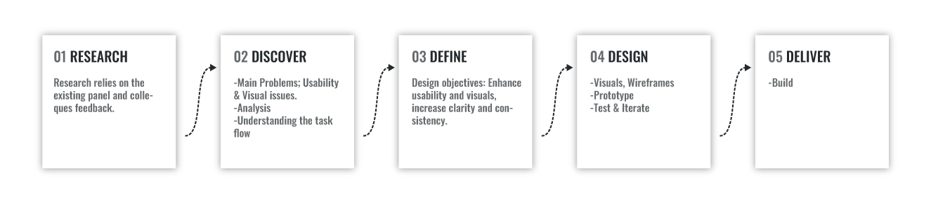
1 Research & Discover
Introduction to original layout
Key problems with the original layout
The fundamental issue with the current layout are variables. Below there are two examples from the two different projects, which communicates the main problems of the system layout. When comparing one to another project we can see that the buttons their size, location and color varies upon each project. Also the color scheme varies upon each projects. The distinction between buttons and non buttons vary and the terminology changes on project basis.
3 Define - Analysis
The fundamental issue with the current panel is that the system components and how they are presented varies from project to project. There are no commonly agreed terms and presented functionalities colors and buttons varies also from project to project although the system components remains the same. The usability issues are diverse and severe.
The result is that if the user is used once the HMI, the experience using the product is different from the previous one. Hence this requires a lot of manual work and wasted hours, when the system components has to be applied always from the scratch to each project. The users must be trained each time to use the release panel differently and thus the user interface can´t be improved deliberately based on feedback. The functionalities of the interface should be same from project to project and the components should be applicable to each project. Due to the limited resources, therefore I decided to limit the design objectives as:
"Increase the clarity and consistency through fixing the main usability issues and thus also enhance the overall usability."
4 Design - Improvements
As earlier described, the issues influencing usability were severe and diverse and most of them were fixed through clear font hierarchy, through unified color scheme, fixed UI-components; status & navigation bar and buttons, added feedback & guidance. Additional Improvements;added iconography and showing only the necessary information, fixed button size, and added feedback and guidance.
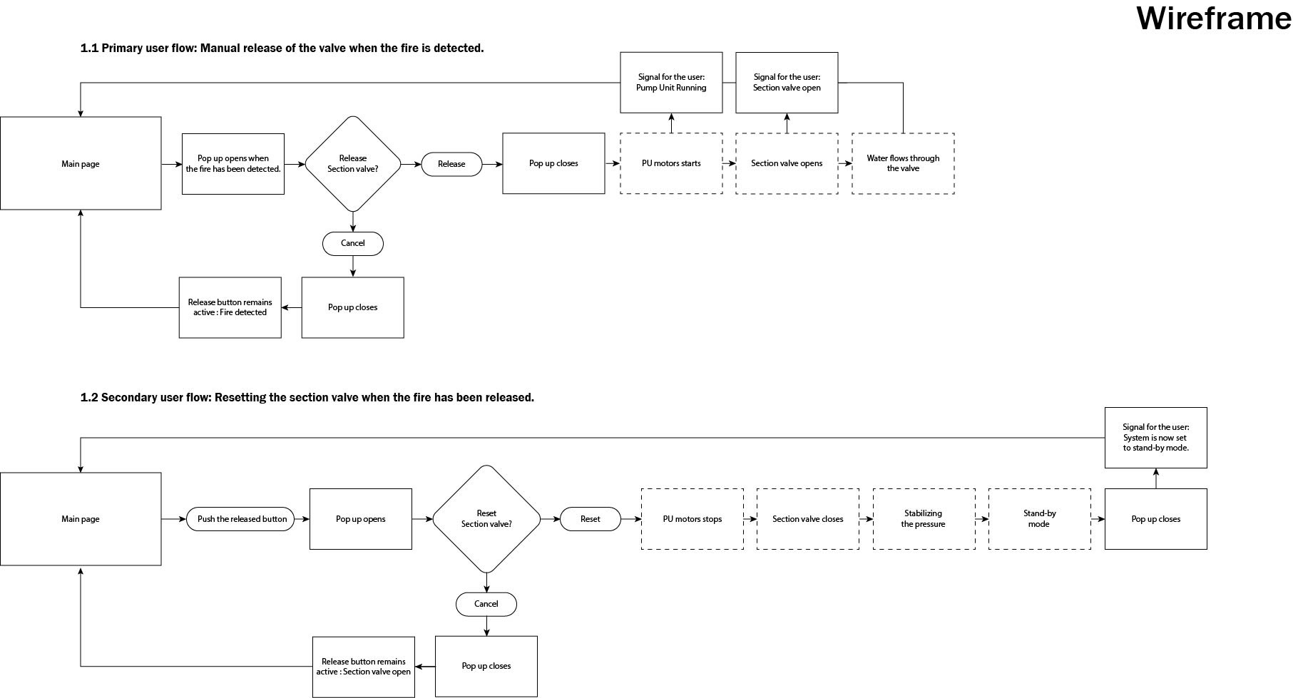
Main Functionality
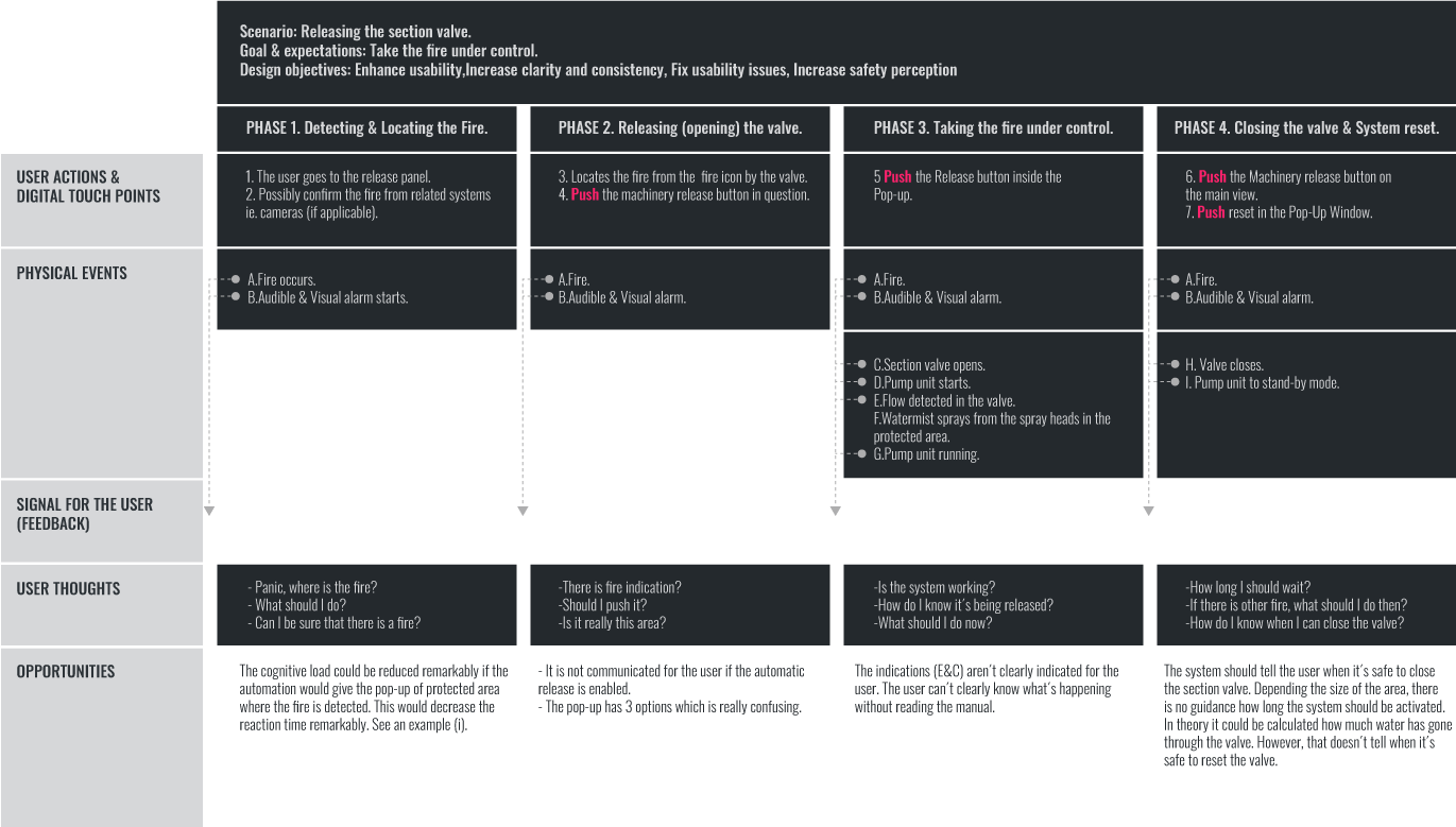
The major change compared to the previous task flow is that when the fire is detected, the automation directly offers a pop-up window to release the section valve. This saves one extra push from the user in the case of emergency.
UI-components
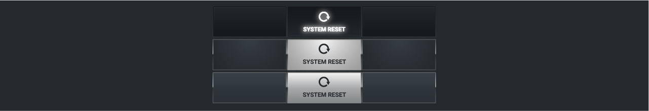
Button design
Navigation bar button evolution
The button design evolution is shown below through initial design and refinements. Above the initial button design.

Status bar
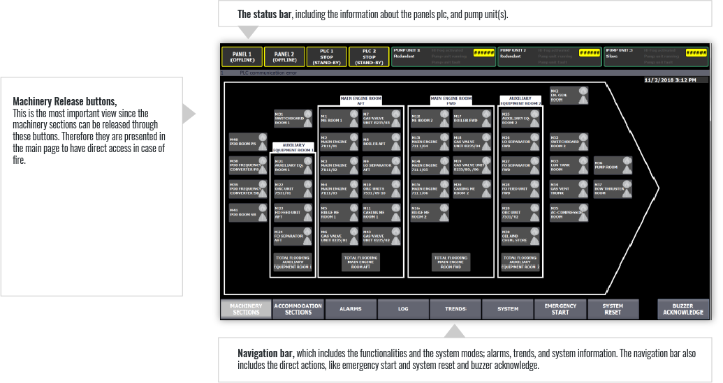
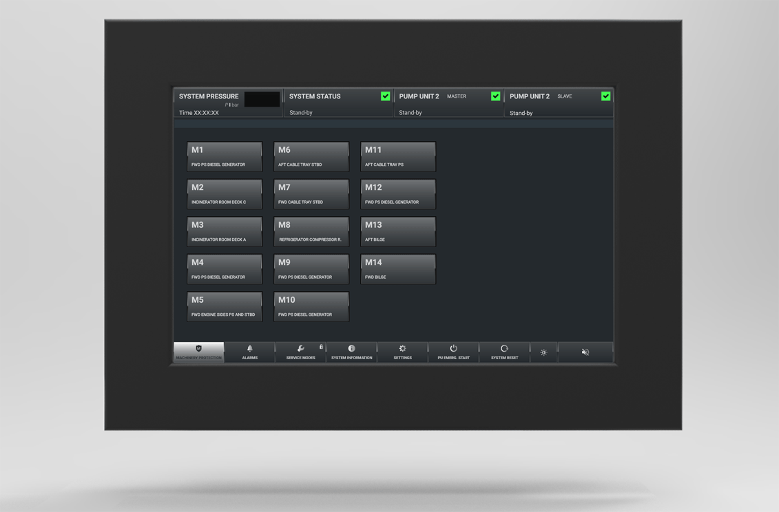
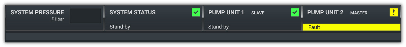
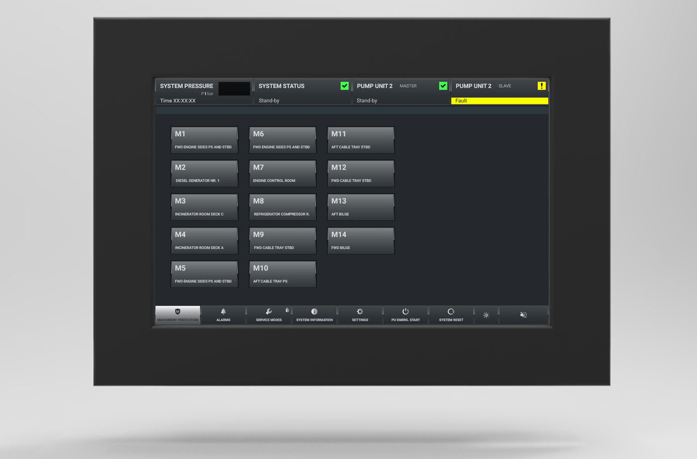
There are various systems in the ships and most of the systems works on full automation on-board. The larger the vessel the more technology is being involved. This was the basis for the layout of the design. The most essential elements has been placed there from left to right; System pressure; System status and the pump units status and gives a notification of the main functionalities for user. Small icons tells the user from a distance, if the system requires attention.
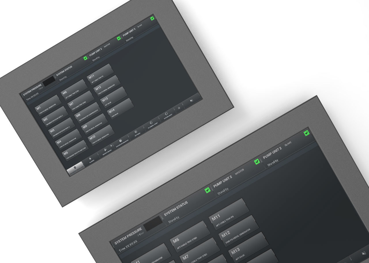
The final user interface
Reflections
Main constraint: Limited freedom
The main constraint of this project was the limited freedom due to the classification societies, which regulated the freedom of design. The second constraint which personally annoyed was the limited possibilities of the automation system, (Siemens logic). The third constraint was the lack of resources.
Room for future Improvements
There could be a lot of room for future improvements, like showing the exact location for the area which is about to be released. However, changing the functionalities requires a lot of user testing. More precise data can be shown and the amount of data just increases in the future. As the ships are complex ecosystems of their own and safety plays crucial role. Although the systems varies, and suppliers, there should be common guidelines when implementing the design.
Variables
The clients and users had different opinions and they value different information to be shown. The users of the equipment vary, the type and size of the vessels varies, the users vary, the amount of protected areas vary. There are no generic solutions for all different type of vessels. What fits for the Oil drill platform, does not work for the cruise ships and vice versa. Having the functionalities fixed will ease the development from the future perspective.
Feeling of empowerment
As the project was conducted with limited resources,which frustrated to make decisions without constant user testing. Being close contact with the users and other stakeholders would have been welcomed executing this size of project. Therefore it was "only way to go" just to improve the product from the existing one and not to design something totally new, which would have required more consolidation. At the same time feeling of empowerment influencing to the fire safety on-board and mastering the tools were the two best things within this project.